For the latest updates to this post please visit the original posting here: How to Customize Colors in Dynamics CRM Charts
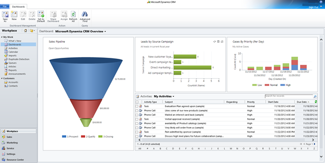
MS Dynamics CRM 2011 is an amazing tool that can show reports in a single view. Charts can easily be seen on the main dashboard of CRM or directly within the entity. With them, you can get a visual representation of data within its source entity. If you’re just starting out on this great feature, see our blog on how to create charts. In this blog, we’ll focus on changing the colors in Dynamics CRM charts.

CRM can generate reports quickly and easily, but it takes some configuration to modify charts. For example, let’s say that in leads we want a pie chart to display the hot section to be red, warm to be orange and cold leads to show as blue.
The first thing we’ll do is find which entity that our chart belongs to. In this example, the pie chart belongs to the leads entity. Under Settings, go to Solutions, where we will create a new solution.

Fill out the form and click Save. If you are selling this solution, you should have a designated publisher. If you are not selling this solution and you do not have a publisher, then simply type Default and hit the <tab> key for CRM to fill in the Default Publisher.

Once you save, the form should bring you to the Components page. Click on ‘Add Existing’ and select entity. Within the popup, select all of the entities that contain a chart that you want to change. For this example, we will select Leads. Once the entities are added to the sidebar, click on export solution. Export the solution as unmanaged.
Note that the way we are going will change the system view and not just a personal view. The file will export in .xml file format. Chose to open in your code writing software (e.g. Visual Studio, Notepad++, or notepad). Do not use WordPad or MS word as these are meant to write documents. Visual Studio and other code writing programs is more appropriate as they are meant for understanding and recognizing code syntax and testing.
As you open the file you’ll have to navigate down through the xml to find <Chart Palette…>. Below is a sample of the code.

If you have multiple entities within the solution, a fast way to find which entity to work on is to click <Control><F> and search for the description or title of the chart that you want to edit. If that is still giving you issues, you can use a color reader to determine the order of colors currently in your CRM, so the color palette displays colors based on a RGB color model. After the quotation marks, any list of colors can be typed in and they will appear in the order typed. This is where we would want to change the color of the pie chart. If we refer back to our photo, there is an order in which the data is organized. In our code 97,142,206 comes first and thus will populate the ‘Hot’ field first. The list of colors you are looking for CRM to auto fill and add them in followed by a semi-colon.

So, for our example, we are going to simply cut and paste the red color to be first. (These are the default colors within Dynamics CRM.) As more fields are added they will be associated to the next color code in the color palette. If only one color is in the color palette then all of the fields will be that color.
| RGB Color Code | Color |
| 97,142,206 | Blue |
| 209,98,96 | Red |
| 168,203,104 | Green |
| 142,116,178 | Purple |
| 93,186,215 | Cyan |
| 255,155,83 | Orange |
| 148,172,215 | Light Blue |
| 217,148,147 | Pink |
| 189,213,151 | Apple Green |
| 173,158,196 | Lavender |
| 145,201,221 | Baby Blue |
| 255,180,138 | Salmon |
Once you make the changes, save the exported file and import it back into the CRM. Reload your CRM by refreshing the page. That’s it!
Here are some other pages that you might be interested in:
- How to Customize Dynamics CRM Column Width for Form Views
- Adding Activity Feeds to the Dashboard
Happy CRM’ing!
The post How to Customize Colors in Dynamics CRM Charts appeared first on PowerObjects.